
How DOI ditched the maze

We've been building sites for the Dullah Omar Institute since back when they were still the Community Law Centre. That's a long enough relationship to learn how an organization actually works, not just what its homepage should say. And that history is exactly what let us spot something that had been quietly frustrating visitors for years: finding your way around an organization with many moving parts felt like wandering through a maze.
DOI runs several distinct areas of work under one roof, alongside its own news, events, courses and publications. Previously we used Plone's Lineage add-on to turn each of these areas into its own mini-site. Click into one, and its own navigation would take over, replacing the main site's menu entirely.
Same Look, Different Navigation, Total Confusion
Here's the snag: DOI's mini-sites all shared the same template, colors and layout. So when a visitor clicked into one, nothing looked different, except the entire navigation had changed underneath them. The other areas of work simply vanished. Poof. Every corridor looked the same, but the doors kept moving.
There's a name for this in UX circles: change blindness. When most of a page stays the same but a key element quietly shifts, people don't consciously clock it, they just get lost. They can't find what they were looking at thirty seconds ago, and start wondering if they've accidentally wandered off the site altogether.
Nielsen Norman Group's research backs this up: changing navigation patterns within a site creates real cognitive load, because it breaks the mental map visitors build of where things are (or, in normal person speak, a navigation that changes is confusing and leaves site visitors lost).
Enter the Mega Menu
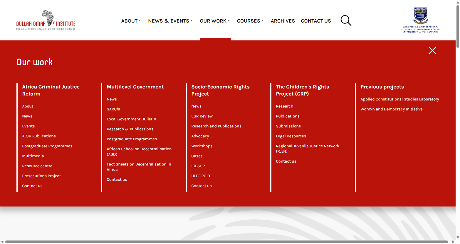
The new DOI site swaps this out for a mega menu: one persistent top navigation that expands to show everything underneath it, rather than replacing itself every time you move around. No more corridors, no more moving doors. Just one map, always in view.
The difference for DOI's visitors:
- Nothing disappears. Every area of work stays visible and reachable, no matter where you are on the site.
- Relationships are obvious. DOI's various areas of work sit together in the menu because they belong together under one institute.
- News, events and courses are centralized. Rather than duplicating content across mini-sites, these are now tagged and pulled into the relevant areas of work automatically. One source, updated once, shown wherever it's relevant. No more hunting through five different "News" pages hoping you land on the right one.
Why It Matters
Navigation isn't decoration, it's the difference between a visitor finding what they came for, as opposed to getting lost and just giving up. For an institute doing research, advocacy and teaching across several fronts, that difference compounds fast: a lost visitor is a missed publication, an unnoticed event, a course nobody applied for. A missed opportunity to move society forward towards a better future.
The mega menu puts DOI's full body of work on display, all at once, from anywhere on the site. No more maze, just a clear floor plan. A small structural change, sure, but one with an outsized effect on how findable the institute's work really is. And honestly, over many years of watching this organization grow and shift, it's enormously satisfying for the Juizi team to give their site a structure that keeps up.